How to properly label boolean fields
The default styling of a checkbox (or toggle switch) in the readonly state may not always provide the best way of visualizing information, potentially leading to confusion and negatively affecting the end-users' experience. This has caused countless feedback, and several redesigns on the readonly mode of the boolean fields. Consultants have tried in some cases to explain within the label of the boolean field itself, what each color means which has resulted in strange and confusing user interfaces. For example, one could see a label like below:
🟢 Debt ("red" means "no")
Why is that? We will explain soon. But first, let's explore the difference between disabled and readonly states.
Readonly vs. Disabled
readonly is not a standard attribute on input elements such as checkboxes, toggle switches or input fields. It's something that we ourselves introduced in Lime Elements' components, pretty much because of the CRM use-cases, and due to the way the "form elements" on the "object cards" are constructed and presented to the end-users, with the intention of visualizing stored data for some user groups, and for others allowing them to modify that data.
A form field is normally there to receive inputs from users. However, when a form field is set to readonly by an admin, it does not function as the original field anymore. The readonly state is set solely for the purpose of "data visualization" for the end-users of the CRM. This is why we do not render the input elements in readonly mode, as if they could be interacted with.
On the other hand, the disabled is a standard state for input elements. When an input component such as a checkbox or input field is disabled we maintain its original look and feel, but add some visual cues to indicate that the component is currently or temporarily disabled, for some reason, and cannot be interacted with right now.
Important
disabledimplies: the field is currently non-interactive but can become "enabled" under certain conditions. For instance, a disabled checkbox might become enabled if the user selects a specific option from a dropdown menu in the UI.readonlyimplies: the field is non-editable and will remain so irrespective of user actions. A readonly field serves as a non-interactive element, solely for illustrating the data.
Why is the default readonly styles of the boolean fields not always the best?
This is really hard to explain… Surprise! But we will try our best. The first thing to keep in mind is the first rule of design:
I'm not the user!
It is extremely easy to fall into this classic trap, and think that the way you see the world (the logical database structure, the user interface details, the chosen labels, etc.) is exactly the same way that your users see and experience the world too. Believe it to not, everyone does this mistake! Even the most experienced designers.
So, first we should acknowledge this fact; and then let's try to explain why seeing a boolean field in a readonly state which is displayed in a form on the object card has often been confusing for our end-users.
Imagine that you have a form for a Customer card, which contains a boolean field in it. This boolean field is called "Debt". You decide to make the field readonly, because to you, it makes perfect sense that the field should not be editable by the end-users. Also, you have setup the whole system right? So you know that the field's value (true or false) is calculated elsewhere in the system or is send to the form automagically, from a 3rd party integration.
Furthermore, when you did setup the form, you also decided to set the value of this boolean field to false, when the system indicates that the Customer has no debts, and set it to true when the Customer has debts.
Everything is perfectly logical… So everyone should understand it, right?
Now you give this to the end-users, and they get back to you and say:
We don't understand what this means. 🤷🤷♀️🤷♂️ It's really confusing… 🤔 It shows a checkmark, and we perceive it as "Everything is OK" and that must logically mean that the Customer has no debts.
Again, don't forget the first rule of design: "I'm not the user!".
You can never exactly know how an individual thinks and makes sense of the visual clues provided on the UI. You may know how the system is setup and what these visual signs mean, but they don't. Additionally, individuals think differently. Which is why some of the end-users would never reach out, as they perceive the UI as you intended. There are so many details that affect users' perception, and sometimes it's not so easy to have a one-solution-fits-all.
As an effort to present data more clearly to the end-user, you may think that adding colors could help. But merely relying on colors to communicate the meaning is not enough, and still would confuse the users.
🔴 Debt (false)
Some users: 🤔 Oh, it's red. I'm being warned that this customer has debts.
🟢 Debt (true)
Some users: 🤔 Oh, it's green. I'm being told that everything is good, and this customer has no debts.
and
Some other users: 🤔 I am actually colorblind and don't really see the difference between green and red (roughly 8% of men and 0.5% to 1% of women are colorblind, translating to around 4.5% of the global population).
There are many examples similar to the "Debt" boolean, found in different Lime CRM installations, such as "Newsletter" (on Persons), "Quit" (on Coworkers), "Invoice", etc…
Enhancing Labels for Better User Perception
The user interface is rife with subtle details that significantly impact user perception. Among these, the field label stands out as a crucial element that defines the data's meaning for end users.
Tip
Even if these fields were not readonly, the chosen labels could be improved.
Many examples that lead to user confusion often feature cryptic, single-word labels, typically nouns. Examples include "Debt", "Newsletter", "Quit", "Bounce", "E-invoice", and so on. Enhancing these labels can significantly reduce user confusion.
Best Practices for Labeling Boolean Fields
The name or label of a boolean field should be as descriptive as possible. Here are some best practices:
-
Use Positive Phrasing: Just like the convention of naming boolean variables in coding, the name of the boolean fields should be positively phrased. For example in code, you would name a boolean prop like this:
isActiveorisEnabled(which are easier for a human brain to understand thanisNotActiveorisDisabled). In a UI design, it is even more important to follow this practice, since you are making the UI for a human brain, not a computer, or not a coder who would find their way through the rest fo the code relatively easily anyway, even if the chosen name is bad. -
Avoid Negatives: Avoid negative words in your boolean variables. For example, "Is not active" or "Is inactive" is confusing. It's better to use "Is active".
-
Be Specific: The name should clearly indicate what the variable represents. For example, "Subscribed for newsletters" is way better than "Newsletter".
-
Use Prefixes: It's common to prefix boolean variables with is, has, can, or should. This makes it clear that the variable is a boolean and what it represents. For example, "Has dept", "Has permission".
-
Consider the Context: The name should make sense in the context where it's used. For example, if you have collapsible section called Coworker, a boolean name of "Is active" does not makes sense in that section. It is better to name the field as "Is still working". While if the collapsible section is called Subscription, then "Is active" makes sense.
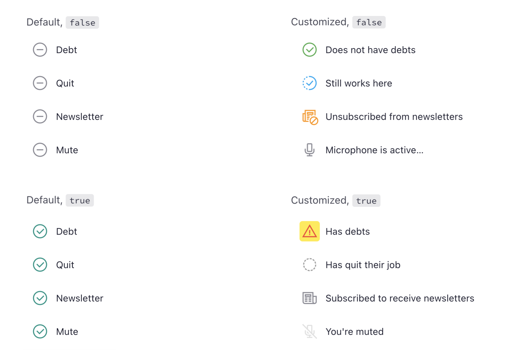
Notice how much better the labels are in this example, And how everything suddenly makes more sense when the fields are readonly. They are still not perfect, but certainly clearer than the previous example.
Oh I can't change the label, it's too risky!
You may rightfully say:
Oh our setup is complex. I don't dare to change the label. Maybe an integration is using it.
Maybe I break something.
Or you may say:
The field is still not 100% clear for some users, even with this change.
We understand! This is why we made it as easy as a simple config for you. This will help you combine colors, icons and labels, to make the meaning more clear for the users. Read more on the next example…
The config in Lime Admin
- Select the boolean field,
- Check the Read-only checkbox
- Write a proper config, like below:
{
    "readonlyLabels": [
        {
            "value": true,
            "icon": {
                "name": "error",
                "color": "rgb(var(--color-red-default))",
                "backgroundColor": "rgb(var(--color-yellow-default))"
            },
            "text": "Has debts"
        },
        {
            "value": false,
            "icon": {
                "name": "ok",
                "color": "rgb(var(--color-green-default))"
            },
            "text": "Does not have debts"
        }
    ]
}
Tip
Icons and colors are optional! Don't feel you have to use them. Specially if you don't find a descriptive icon. Simply alternating the text could be more than enough.
We also strongly recommend you to read more on labeling boolean fields.