Design guidelines for Actions in the web client
Actions
When users interact with the CRM, they often engage in various manual tasks, including creating new objects, updating existing information, or adding notes for future reference. Some of these actions are straightforward, like clicking a "SAVE" button or selecting options from a menu, while others are more complex and involve multiple steps, such as preparing an invoice or sending a document for signing. Regardless of their complexity, all these actions share a common need – a visible element in the user interface that allows users to initiate the process.
This guide aims to provide you with insights into what's possible and how to make informed decisions, when you're developing new features for a customer. We strongly recommend consulting a designer for further assistance!
Types of actions
The Web Client's user interface provides predefined locations for various types of actions. However, when you're working on developing new features for a customer, deciding where to position the trigger element for your intended action can be a challenge.
To simplify this decision-making process, the first step is to categorize the "type" of action your feature will provide to the end user. Once you can clearly define this, determining the appropriate placement for the action trigger becomes straightforward. In essence, there are only two categories of actions: Promoted Actions and Un-promoted Actions.
1. Promoted Actions
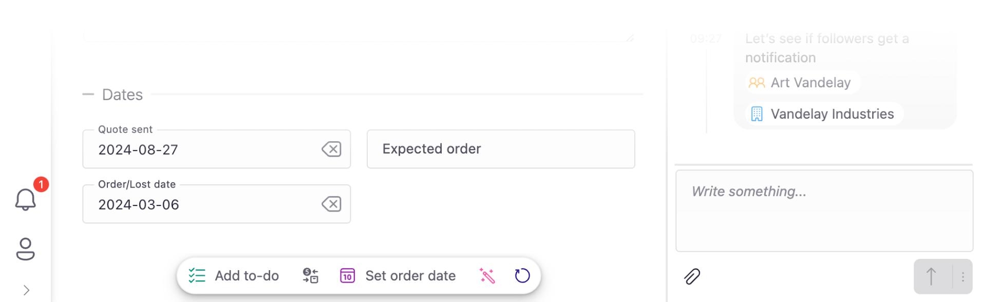
There are some actions that are very straight-forward and their effect is immediate. Users frequently need quick access to these actions without being forced to navigate or scroll to a certain area of the user interface. This means that the actions should be easily discoverable by the user. We refer to these as "Promoted Actions". They are thoughtfully grouped and displayed in an action bar on an object card, referred to as the "Contextual Action Bar". This contextual action bar is consistently visible across all tabs.
Think of these actions as if we are telling the end user:
It is very likely that you want to do one of these things with the record you have in front of you.
or,
We thought that right now, you’d be looking for one of these action, and next time you come here again, you’d most probably be looking for the same things. So, we've bundled them here for easy access.
Promoted Actions are inherently contextual. They are relevant here and now! Hence, we've aptly named the designated area for these actions the "Contextual Action Bar" and ensured it's consistently available across all tabs. Consequently, it's crucial to remember that actions lacking immediacy or relevance to the current context should not be placed within this section!
While Promoted Actions are easily accessible through the Contextual Action Bar, it's crucial not to overwhelm this area with every possible action that can exist on an object card. The term "contextual" is essential, indicating that the actions displayed should be relevant to the user's current needs, right now.
We intend to encourage and or guide the user to pick one of the presented actions. First of all, we cannot display too many actions at once, because that would only confuse the user and make it hard to find the most relevant action amongst the presented ones. Secondly, there can’t be too many actions at a given context that are all equally important, in demand, and relevant.
When deciding which actions to display, always ask yourself:
- Ok… what are the most relevant top 5 actions that the end-user might want to do in this specific context?
- What are the most relevant Jobs-to-be-Done in this particular context?
- When the user comes here, what is it that they are most likely intending to do?
Examples could be “moving the record forward” in a linear process, such as in "ticket handling". Examples could include actions like:
- “Close” (on a Ticket card), or
- “Re-open” (which should only be shown when a ticket is "closed"),
- “Send for e-Sign” (on a Document card),
- "Sign a document" (on a Company card),
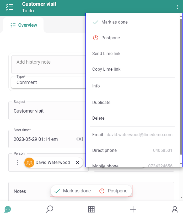
- “Mark as Done” (on a Todo card),
So, try to hide the actions that are not relevant now. We call them Un-promoted Actions, and there is a specific place for displaying them in the CRM.
2. Un-promoted Actions
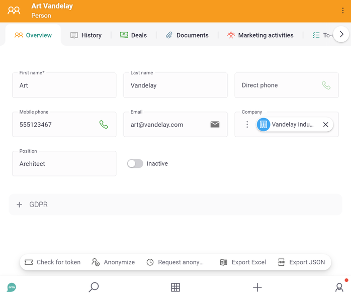
Actions that you prefer not to emphasize should fall under the category of un-promoted actions. These are actions such as "Archive" or "Anonymize," primarily intended for infrequent or specialized use cases.
Furthermore, certain actions may carry a significant level of risk, irreversibility, or potential harm, making it advisable not to promote them to the user. The most common example could be "Delete".
This rationale is why some views do not display un-promoted actions on the presented records. For instance, in the "List View," you won't encounter un-promoted actions, but in the "Card View," they are discreetly accessible via the ⋮ menu at the top right corner.
| 
|
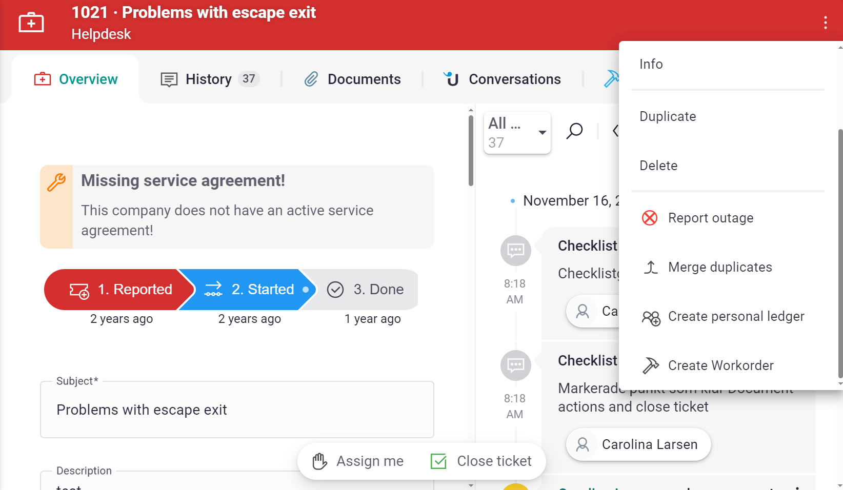
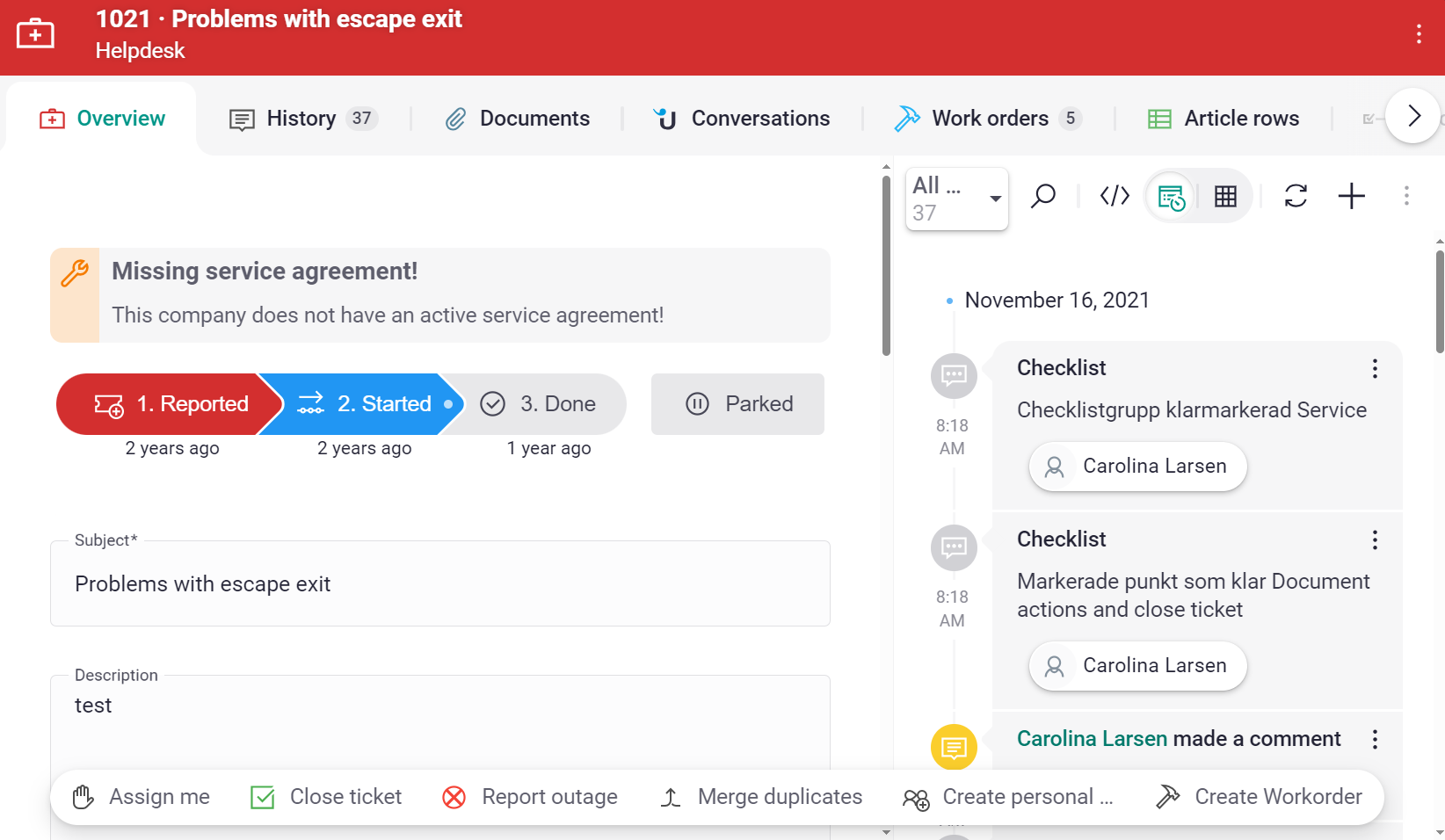
| ✅ Do. Promote actions like "Assign me" and "Close ticket" that the user is likely to perform, here and now. "Assign me" should only show if I'm not already assigned ans "Close ticket" shold only show if ticket is open. The other actions should be considered not as relevant here and now and fit well in the ⋮ menu. | ❌ Don't. Putting all actions as promoted actions causes noise and encourages the user to do actions that are most likely not relevant here and now. One can only hope that "Merge duplicates" is not something that needs to be done at every ticket. |
| 
|
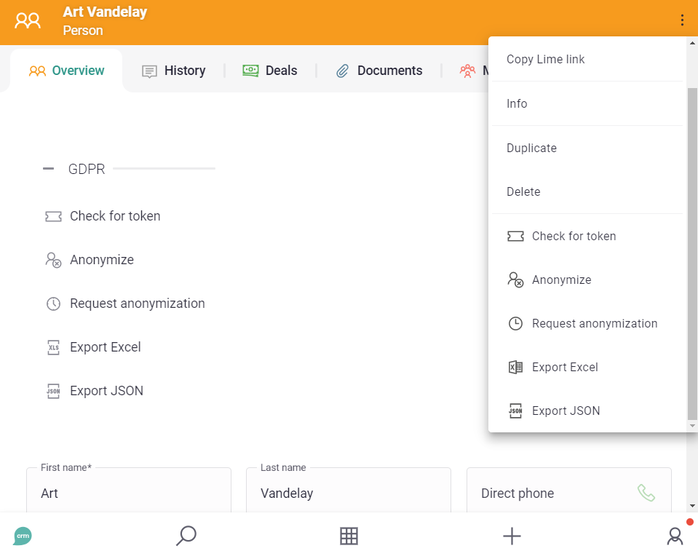
| ✅ Do. Actions related to GDPR are most of the time not relevant here and now. Therefor, they should be kept within the GDPR widget or shown as un-promoted actions. | ❌ Don't. Actions related to GDPR are most of the time not relevant here and now. Therefor, they should not be shown as promoted actions. |
Use verbs in imperative mood
The imperative mood is a grammatical mood that forms a command or request. The imperative mood is used to demand or require that an action be performed. Thus, actions are always communicated in imperative form, as a verb, encouraging the user to do something (or sometimes from the user's perspective, they are commanding the system to to something by pressing the action button). "Create", "Write", "Add", "Download" or "Open" are examples of good words to use.
It's crucial to recognize that the context plays a pivotal role in selecting the most fitting verbs, sometimes in conjunction with other words. For instance, "Send for e-Sign" suits a button on a Document card, while "Sign a document" is a more appropriate title for a button that triggers the same process, albeit from a Company card.
| 
|
| ✅ Do. Use verbs in imperative form such as “Add” or “Upvote” | ❌ Don't. Do not use nouns since it is hard to understand what such a button would do. |
⚠️ Not Everything Is an Action!
Not everything qualifies as an action, and not every action needs to be represented as a button that opens up an ugly modal or redirects to a new browser tab, in which the user can perform what they want.
In many cases, thoughtfully designing a widget is more suitable choice. Keep in mind that modals are very intrusive elements, since they block the user from interacting with the rest of the page or see the visible content.
So do not mistake Actions for just being “buttons that do things”. The contextual action bar is not a slot for “buttons”, but for for genuine "actions" – actions that, when initiated, are swiftly executed.
The question of "what is a better design then?" is a complex one, with the answer often varying according to the specific use case. Consulting a skilled designer is an excellent approach to addressing this question, as there are numerous potential solutions.
Nevertheless, a typical solution to this design challenge may involve considering whether the task that the user intends to do qualifies as a "promoted action" or "promoted task". If the user frequently needs to perform a particular task in a specific context, and that task should be easily accessible, a minimalist user interface (referred to as a "widget") can be designed for seamless task execution. This widget can be positioned in the designated widget area on top of the Object Cards, providing a streamlined and efficient user experience.
|
| 
|
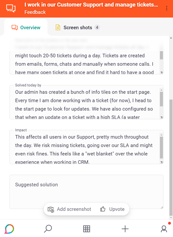
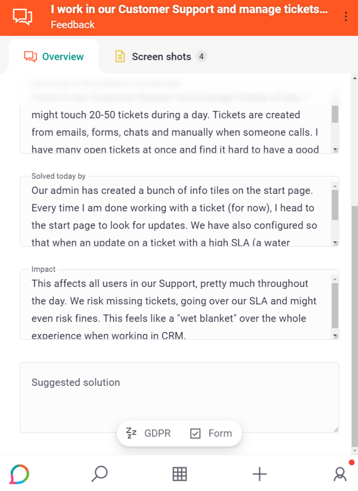
| ✅ Do. Use actions for simple, straight-forward things. | ❌ Don't. Do not use actions for things that are not "actions". "GDPR" and "Form" are not actions. "GDPR" for example is a "menu"; a group of options that are related to the GDPR law. |
| 
|
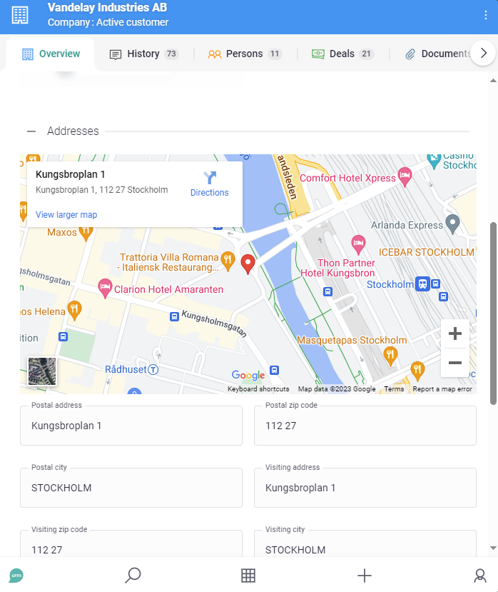
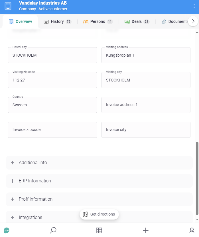
| ✅ Do. Sometimes a widget, such as a map, is useful. A widget could, as in this example, hold a contextual action such as “View larger map”. | ❌ Don't. “Get directions” is somewhat out of context and not related to the information it will use (the address). |
Use icon colors sparsely
Please do not apply an icon color, just because you can! Only add a color if you really intend to communicate meaningful things with colors. Concepts such as Danger, Caution, Warning, Safety, etc…
|
| 
|
| ✅ Do. Only use icon colors when you really need them. | ❌ Don't. Do not apply colors to icons just because you can. |
Icon-only actions and accessibility
When configuring promoted actions in the CRM, you have two powerful options that work together to create both a clean visual design and an accessible user experience: Icon title and Hide label. Understanding how these options work will help you make informed decisions when setting up action bars.
Icon title: Enhancing accessibility and tooltips
The Icon title property is essential for creating accessible and user-friendly action buttons. It serves two important purposes:
- Accessibility for screen readers: Screen readers cannot visually interpret icons, so the icon title provides the necessary context for users with visual impairments
- Enhanced tooltips: When users hover over an action button, the tooltip displays a combination of the icon title and the action label, providing more complete information
Understanding the relationship between label and icon title:
In most cases, the action's label is descriptive enough on its own. For example:
- "Close ticket" clearly explains what will happen
- "Download PDF" needs no additional context
- "Send email" is self-explanatory
For these actions, the icon is primarily decorative—it enhances visual appearance and makes the action more quickly recognizable, but it doesn't carry essential meaning on its own.
However, some design approaches favor a more minimal interface by using the icon as part of the label's meaning. Consider these examples:
- ➕ icon + "Todo" text: For a sighted user, this combination visually reads as "Add New Todo"
- 🔄 icon + "List" text: Visually interpreted as "Refresh List"
- 🗑️ icon + "Selected" text: Visually reads as "Delete Selected"
In these cases, the icon isn't just decorative—it's functioning as a word in the action's description. For screen reader users, however, icons without titles are completely hidden, meaning they would only hear "Todo," "List," or "Selected"—missing the crucial verb that explains what the action does.
When to use Icon title:
- You're using a minimal label that doesn't fully describe the action on its own (e.g., "Todo" instead of "Add New Todo")
- You want to provide enhanced tooltips that give users more context when they hover
- You need to ensure screen reader users understand the complete meaning of the action
- You're designing icon-only actions (where Hide label is enabled)
Hide label: Creating a minimalist action bar
The Hide label option allows you to display an action as an icon only, without showing the text label. This creates a more compact, visually clean action bar—particularly useful when you have multiple actions competing for limited space.
When to use Hide label:
- You want to save space in the action bar
- The icon alone is clear enough to communicate the action's purpose
- You're designing for a floating action bar where space is premium
- You want a more minimalist, less cluttered interface
How it works:
The behavior of hiding labels depends on where the action appears in the interface:
- In the floating action bar: The label disappears immediately, showing only the icon
- In menus (such as the "⋮ Unpromoted actions" menu): The label will still be displayed for clarity
Note
The Hide label option only works when an icon is defined for the action. If no icon is set, the label will remain visible regardless of this setting.
Using Icon title and Hide label together
The real power comes from combining these two options strategically. Here's how they work together:
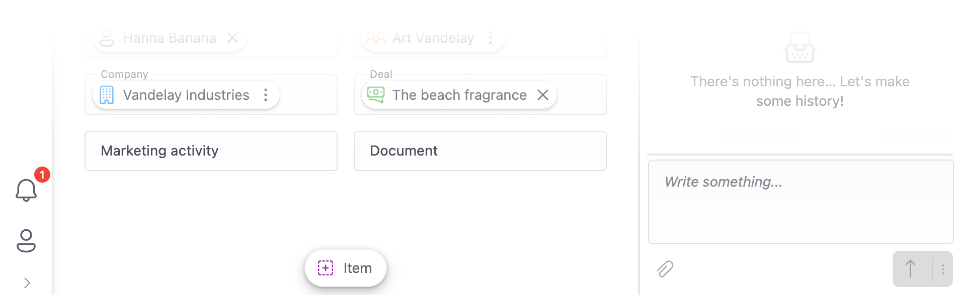
Scenario 1: Icon + full descriptive label (Icon title NOT needed)
Result: Users see "✓ Mark as Done". The icon is decorative. Screen readers read "Mark as Done". Tooltip shows "Mark as Done".
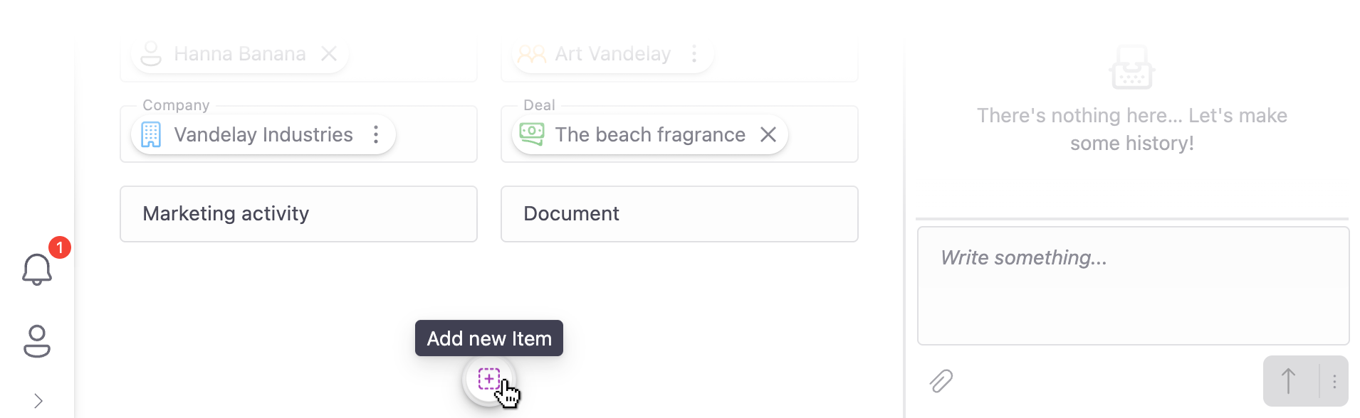
Scenario 2: Icon only with descriptive icon title (Icon title REQUIRED)
Result: Sighted users see only the ✓ icon. Screen readers read "Mark as Done" (combining icon title + label). Tooltip shows "Mark as Done" when hovering.
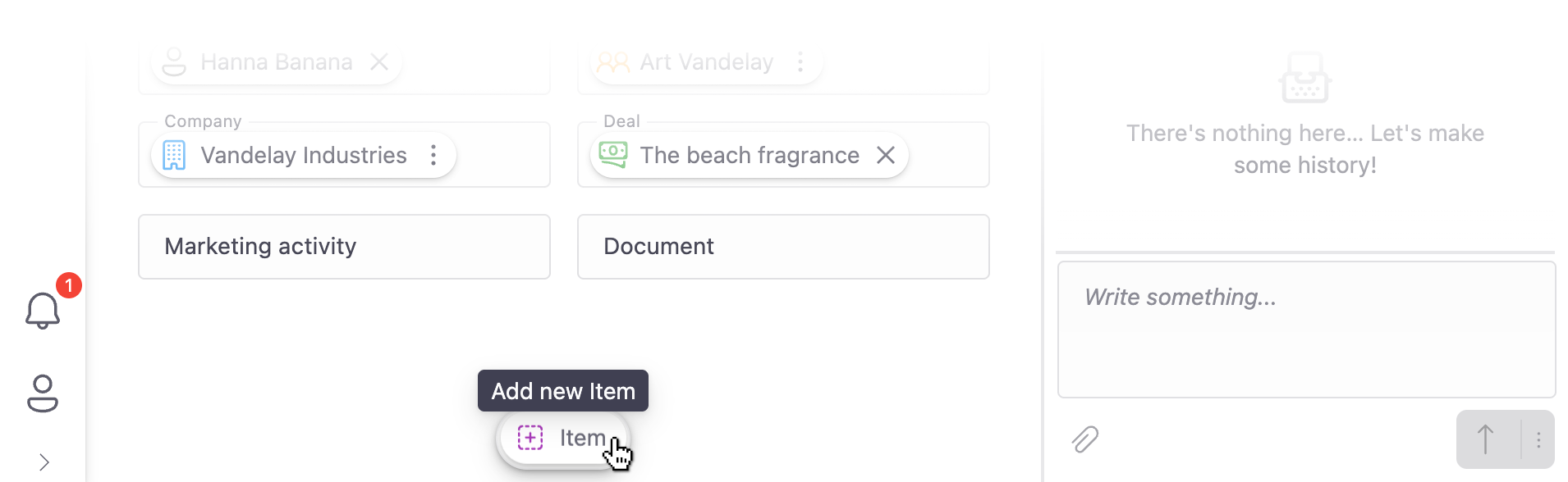
Scenario 3: Icon + minimal label with icon title (Icon title ENHANCES)
Result: Users see "➕ Item". Screen readers read "Add new Item" (combining icon title + label). Tooltip shows "Add new Item" when hovering.
Best practices for configuring actions
1. Use icon titles even with visible labels for minimal text designs
When your design uses an icon + minimal text (like "➕ Item"), adding an icon title improves the experience for:
- Screen reader users who get the complete action description
- Sighted users who see a more descriptive tooltip on hover
2. Maintain consistency in the action bar
Mixing labeled and unlabeled actions within the same action bar can feel confusing and unprofessional. If you choose to hide labels for some actions, consider whether all actions in that bar should follow the same pattern.
| 
|
| ✅ Do. Use a consistent approach across all actions in the same context. | ❌ Don't. Mix some actions with labels and others without labels randomly. |
3. Only hide labels when icons are truly self-evident
Before hiding a label, ask yourself: "Would a new user understand what this icon does without any text?" Common, universally recognized icons (like trash for delete, plus for add, or checkmark for complete) work well on their own. Custom or less common icons should keep their labels visible.
4. Test with a screen reader
If possible, test your action bar configuration with a screen reader to ensure that all actions are announced clearly and completely. This is the best way to verify that your icon titles are effective.
Tip
Icon titles support translation keys, just like action labels. Use translation keys for both to ensure your multi-lingual solutions work correctly across all languages.