Configuring the Object Card View
Info
This guide is only valid for the new design of the Lime CRM Web Client
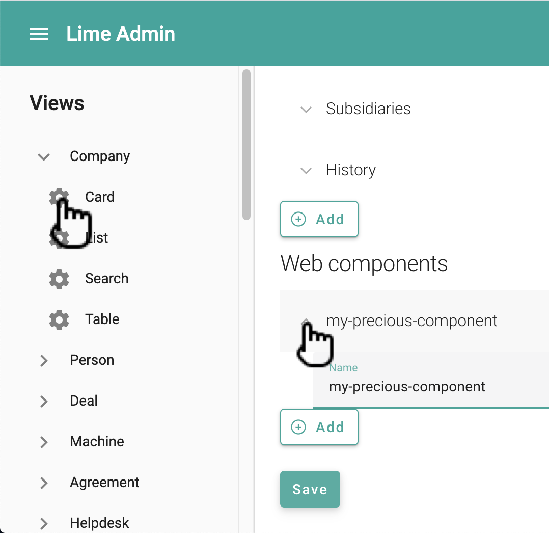
Adding web components to the card
Any web component available in your solution can be added to the details tab on the object card. This is done in the card config in Lime Admin:
It's also possible to update the config via the code editor:
{
  "header": [
    ...
  ],
  "sections": [
    ...
  ],
  "relations": [
    ...
  ],
  "components": [ // <-- Update this section
    {
      "name": "limepkg-my-web-component-a"
    },
    {
      "name": "limepkg-my-web-component-b"
    },
  ]
}
You can also send in custom properties and/or attributes to your web component by providing a "props" section:
{
    "name": "limepkg-my-web-component-a",
    "props": {
        "name": "Hello, World!"
    }
},
What about the "lwc.config.json" file?
It's also possible to use the old way of configuring which web components to show on the details tab - via the lwc.config.json file. But this way of configuring has been deprecated and will be removed in future releases of Lime CRM. We therefore recommend that you upgrade your solution configurations.
For any components that are configured both the old way (in lwc.config.json) and the new way (in the views), the new way takes precedence, and the old config is ignored.
Tabs
Each object card is composed of a details tab, a set of relation tabs and a set of custom tabs. There is one tab added for each relation described in the card config.
Tab Views
Each tab can have one or several different views. You configure that via the general config for each limetype in lime-admin:
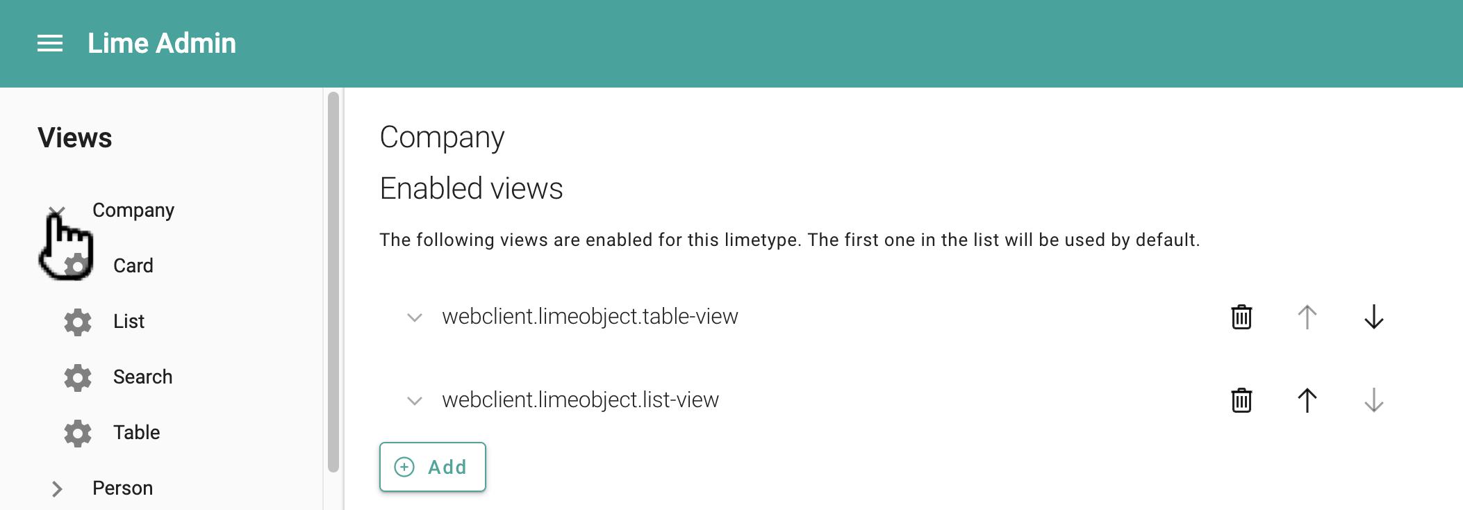
The first one in the list will be selected as the default view.
The following views exist in the platform and can be used by any solution:
| View | Default title (msgid) |
Default icon |
|---|---|---|
limec-table-view |
webclient.limeobject.table-view |
activity_feed_2 |
limec-list-view |
webclient.limeobject.list-view |
insert_table |
limec-history-view |
webclient.limeobject.history-view |
property_with_timer |
Each view is represented by a single web component. In addition to using any of the provided views listed in the table above, you create your own web component to work as a view, and use it here.
Each view can be configured to use a custom title and icon. The title is a msgid that references a translation described in your solution's translations module or in another limepkg. (Read more about translations here.)
You can also configure the views via the code editor:
{
  ...
    "general": {
    "views": [
      {
        "title": "webclient.limeobject.table-view",
        "icon": "insert_table",
        "view": {
          "name": "limec-table-view"
        }
      },
      {
        "title": "webclient.limeobject.list-view",
        "icon": "activity_feed_2",
        "view": {
          "name": "limec-list-view"
        }
      }
    ]
  }
}
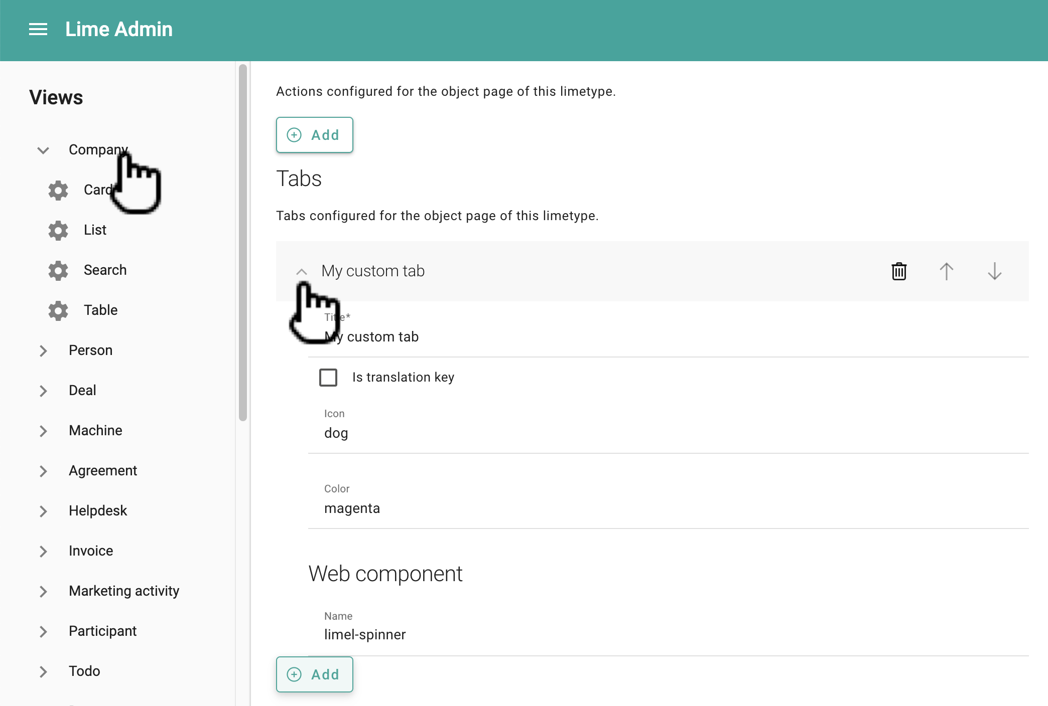
Custom tabs
Adding a custom tab is simple. All you have to do is configure the tab via Lime Admin:
You can also configure it via the code editor:
...
"tabs": [
      {
        "component": {
          "name": "my-custom-tab-component"
        },
        "title": "My custom tab",
        "icon": "dog",
        "color": "magenta"
      }
    ]
Actions
You can add actions to the object card via the general config in Lime Admin. The only thing you need to specify is the ID of the action. For info about how to create actions, see this tutorial.