Warning
This page is about configuring the old start page grid. From version 2.372.0 of lime-crm (lime-webclient 46.606.0), there is a new start page. The start page grid is deprecated and it is therefore recommended to not do any configuration of this but use the new start page instead.
Configuring the Start Page Grid
This guide aims to provide an introduction to configuring the start page grid in Lime CRM Web Client.
What We've Got
Let's assume we have a few Info Tiles configured in the dashboard
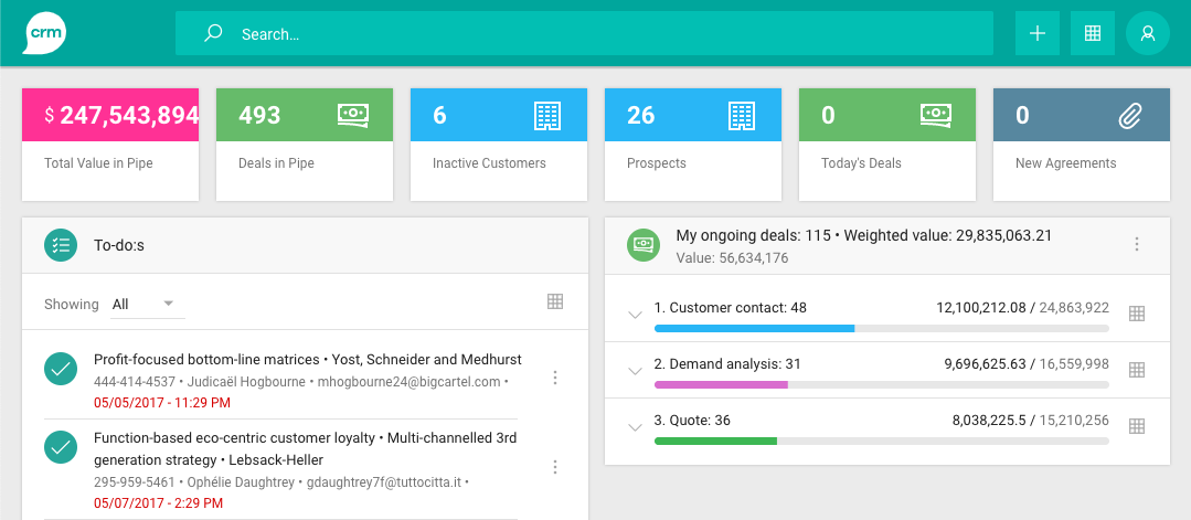
Each tile configuration has a name, as seen in the image below:
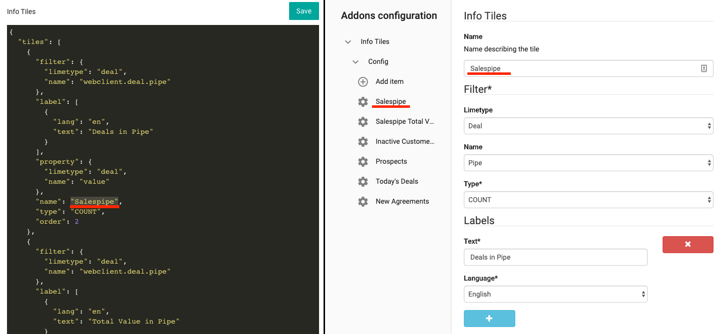
(Lime Admin 1 to the left, Lime Admin 2 to the right)
Configuring the Grid
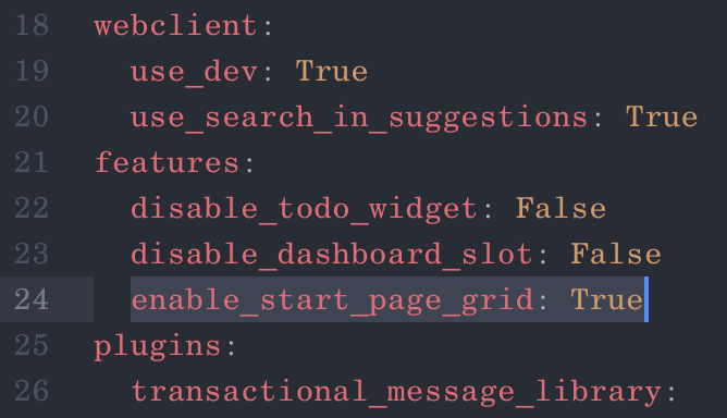
If you haven't already enabled the feature switch enable_start_page_grid, now is a good time to do so. The switch is enabled in the server configuration file:
Now we will create a configuration to use these Info Tiles in the start page grid. Start by going to the Start Page Designer in Lime Admin 2.
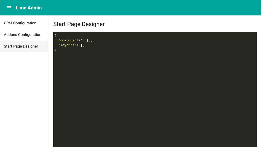
First, let's define a single Info Tile to use in the grid:
{
    "components": [
        {
            "name": "infotiles-tile",
            "id": "pipe",
            "config": "Salespipe"
        }
    ],
    "layouts": []
}
There are three properties here:
name: the name of the component to use. This is the same as the html tag for the component, except the brackets.id: used for configuring the grid layout. Usually a short version of the component name. No spaces allowed!config: the configuration that will be injected into the component. What exactly should be supplied here is decided by the component you are using. In this case, we are usinginfotiles-tile, and this component wants thenameproperty from the tile configuration. It then uses this property to fetch the full configuration for the tile.
This alone will show nothing on the start page. For something to actually show up, we need to define a grid layout as well:
{
    "components": [
        {
            "name": "infotiles-tile",
            "id": "pipe",
            "config": "Salespipe"
        }
    ],
    "layouts": [
        {
            "size": "desktop",
            "css": "\"pipe pipe\" \"pipe pipe\""
        }
    ]
}
As you might have noticed, the id we gave the component earlier, pipe, is used in the css property of the layout. The value of the css property looks quite odd at the moment, but it will be a little bit easier to explain if we add a few more components first.
For now, your start page should look something like this, provided your browser window is wide enough for the grid to use the desktop layout:
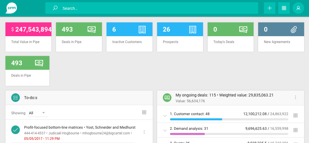
(Note that the Info Tiles in the top row are the ones configured for the old dashboard slot. The single Info Tile on the second row is the one we just placed in the grid.)
Info
From lime-crm>=2.93.0 we automatically hide web components in the old slot if they are configured via Lime Admin.
If, on the other hand, the window is too narrow, the Info Tile we just configured will not show up, because we didn't add it to the tablet or phone layouts yet. We'll do that later.
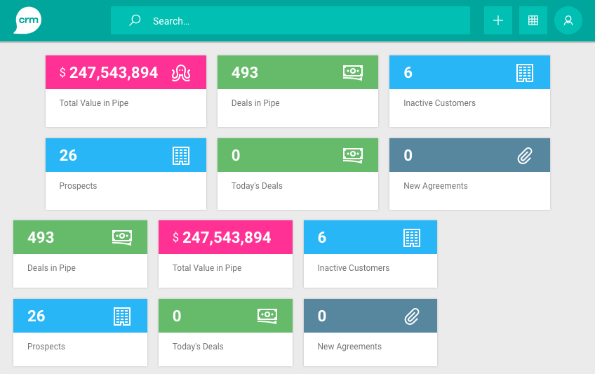
For now, let's add the rest of the Info Tiles:
{
    "components": [
        {
            "name": "infotiles-tile",
            "id": "pipe",
            "config": "Salespipe"
        },
        {
            "name": "infotiles-tile",
            "id": "pval",
            "config": "Salespipe Total Value"
        },
        {
            "name": "infotiles-tile",
            "id": "inac",
            "config": "Inactive Customers"
        },
        {
            "name": "infotiles-tile",
            "id": "pros",
            "config": "Prospects"
        },
        {
            "name": "infotiles-tile",
            "id": "deal",
            "config": "Today's Deals"
        },
        {
            "name": "infotiles-tile",
            "id": "nagr",
            "config": "New Agreements"
        }
    ],
    "layouts": [
        {
            "size": "desktop",
            "css": "\"pipe pipe pval pval inac inac pros pros deal deal nagr nagr\" \"pipe pipe pval pval inac inac pros pros deal deal nagr nagr\""
        }
    ]
}
As you can see, I've used very short values for the id properties. You can absolutely use longer ones, but using these very short id:s will make explaining the css property a little easier.
The main reason the css property is looking so hopelessly messy, is that we can't use linebreaks inside strings in json. But there's nothing stopping us from adding some temporary line breaks, which we'll remove before saving:
{
    "components": […],
    "layouts": [
        {
            "size": "desktop",
            "css": "
                \"pipe pipe pval pval inac inac pros pros deal deal nagr nagr\"
                \"pipe pipe pval pval inac inac pros pros deal deal nagr nagr\""
        }
    ]
}
At this point, you can probably see that what we're doing, is basically "drawing" the components onto the grid layout.
Let's add a layout for each of the smaller screen sizes as well, and you'll see what I mean:
{
    "components": […],
    "layouts": [
        {
            "size": "desktop",
            "css": "
                \"pipe pipe pval pval inac inac pros pros deal deal nagr nagr\"
                \"pipe pipe pval pval inac inac pros pros deal deal nagr nagr\""
        },
        {
            "size": "tablet",
            "css": "
                \"pipe pipe pval pval inac inac\"
                \"pipe pipe pval pval inac inac\"
                \"pros pros deal deal nagr nagr\"
                \"pros pros deal deal nagr nagr\""
        },
        {
            "size": "phone",
            "css": "
                \"pipe pipe pval pval\"
                \"pipe pipe pval pval\"
                \"inac inac pros pros\"
                \"inac inac pros pros\"
                \"deal deal nagr nagr\"
                \"deal deal nagr nagr\""
        }
    ]
}
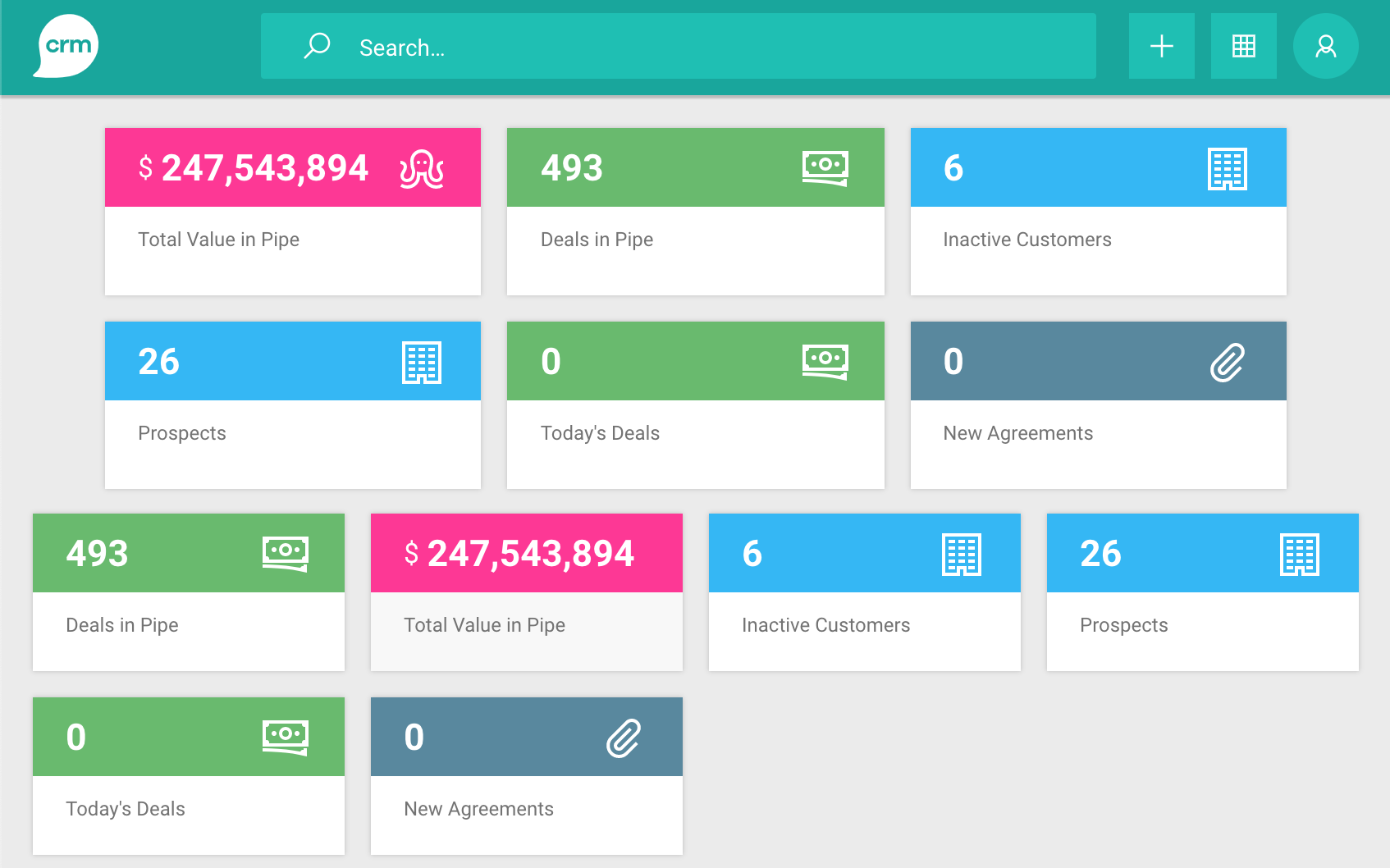
If we remove the extra linebreaks, and save, we'll have Info Tiles on all screen size modes, including tablet, which is shown below:
Again, we see the Info Tiles in the dashboard slot (the top two rows), and in the grid (the bottom two rows).
As you can see, in tablet mode, the Info Tiles end up off-centre, to the left. This is because the tablet mode uses 8 columns, instead of the 6 used by the older version of the Info Tiles add-on. So, to make a nice layout, we'll have to move things around a little:
{
    "components": […],
    "layouts": [
        …
        {
            "size": "tablet",
            "css": "
                \"pipe pipe pval pval inac inac pros pros\"
                \"pipe pipe pval pval inac inac pros pros\"
                \"deal deal nagr nagr .... .... .... ....\"
                \"deal deal nagr nagr .... .... .... ....\""
        },
        …
    ]
}
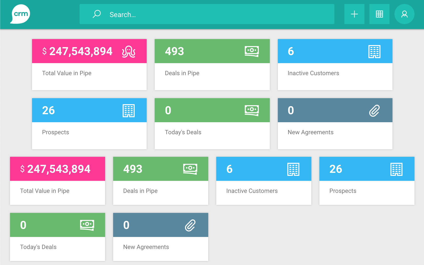
Note the ..... These are representing empty cells. They are needed because all rows in the layout need to define the same number of cells. You don't have to use four dots, any string that isn't defined as the id of a component would work, but I like using dots, because they stand out visually from the id:s that represent components.
Here's the result:
Now let's move the Info Tile for "Total Value in Pipe" to the leftmost spot, so it matches the old configuration:
{
    "components": […],
    "layouts": [
        …
        {
            "size": "tablet",
            "css": "
                \"pval pval pipe pipe inac inac pros pros\"
                \"pval pval pipe pipe inac inac pros pros\"
                \"deal deal nagr nagr .... .... .... ....\"
                \"deal deal nagr nagr .... .... .... ....\""
        },
        …
    ]
}
Note that we've only swapped the two Info Tiles in the tablet layout. Unless we change the desktop and phone layouts, the "Deals in Pipe" tile will still show up to the left of the "Total Value in Pipe" in those modes.
Spanning columns and rows
As you've seen, so far, we've let each component take up exactly 2x2 cells in the grid. Different components will of course need different amounts of space. A component may be dynamic and have a minimum and maximum number of rows and columns, or it may be "fixed" and require a specific number of rows and/or columns. How many rows and columns a component will need should be stated in the documentation for the component.
Note that components have access to the current screen state (desktop, tablet, or phone), and because of that, a component might render differently depending on the screen mode. For example, a component might render a large diagram in desktop mode, a more compact diagram in tablet mode, and a small button which brings up the diagram in a dialog when the screen mode is phone. The same component might thus require a different number of rows and columns in different screen modes. If so, this should also be stated in the component's documentation.
When laying components out on the grid, please keep in mind that the grid will need some "rythm" to feel like an ordered grid, and not just a jumbled mess.
The columns should, generally, be thought of in "pairs". For example: the phone mode has 4 columns. But when laying out the grid, you should think of these as 2 columns, with the possibility of using 0.5 columns if 1 column is too wide. In other words, don't give a component 3 columns. Give it 2 or 4. If 2 is way too wide, it's ok to give it 1 column. If there are any other components that also need a 1 column space, put them next to each other, when possible, to fill the 1 column hole otherwise created.
For rows, the concept is similar. For smaller components, primarily use multiples of 2 (2, 4, 6). For larger components, primarily use multiples of 4 (8, 12, 16, 20). If needed, use 1 row. Avoid 3, 10, 14, 18, etc. Never use any odd number of rows above 3.
Phone layout
In summary: For phone, primarily use 2 or 4 columns. If needed, use 1 column. Never use 3 columns.
Tablet layout
The same goes for tablet. For any one component, primarily use 2, 4, or 8 columns. If needed, use 1 or 6 columns. Avoid 3 columns. Never use 5 or 7 columns.
Desktop layout
For desktop, 12 columns are used, and these may be split into a 4 or 6 "main columns" rythm. However, note that switching between 4 and 6 "main columns" rythm tends to create a "messy" feel.
When using 4-rythm, primarily use 3, 6, and 12 columns. When needed, use 1 and 9 columns. Avoid 2, 4, 8, and 10 columns. Never use 5, 7, or 11 colums.
When using 6-rythm, primarily use 2, 4, 6, and 12 columns. When needed, use 1, 8, and 10 columns. Avoid 3 and 9 columns. Never use 5, 7, or 11 columns.
(Be especially aware of this when developing a component! If your component requires 4 columns in desktop mode, try to make it work in 3 and/or 6 as well, so that it will fit nicely into grids with 6-rythm as well as those with 4-rythm.)