Configuring the Object Card View
Adding web components to the card
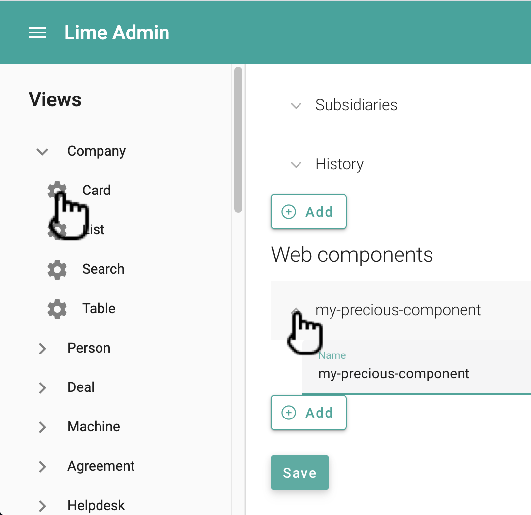
Any web component available in your solution can be added to the details tab on the object card. This is done in the card config in Lime Admin:
It's also possible to update the config via the code editor:
{
  "header": [
    ...
  ],
  "sections": [
    ...
  ],
  "relations": [
    ...
  ],
  "components": [ // <-- Update this section
    {
      "name": "limepkg-my-web-component-a"
    },
    {
      "name": "limepkg-my-web-component-b"
    },
  ]
}
You can also send in custom properties and/or attributes to your web component by providing a "props" section:
{
    "name": "limepkg-my-web-component-a",
    "props": {
        "name": "Hello, World!"
    }
},
What about the "lwc.config.json" file?
It's also possible to use the old way of configuring which web components to show on the details tab - via the lwc.config.json file. But this way of configuring has been deprecated and will be removed in future releases of Lime CRM. We therefore recommend that you upgrade your solution configurations.
For any components that are configured both the old way (in lwc.config.json) and the new way (in the views), the new way takes precedence, and the old config is ignored.
Replacing a form field with a web component
Each form field is rendered using a default component. Which one depends on the type of the field. It's possible to configure any field to use a custom web component instead. You can for instance render a regular text field as a code editor, render a number field as a progress bar or replace the switch on a yes-no field with a custom button.
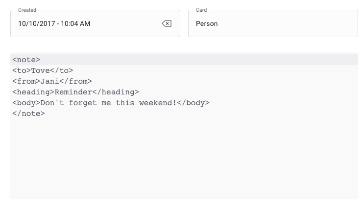
As an example, consider the following view:
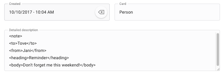
This view has a field called Detailed description that contains xml. Maybe we could visualize this in a better way? - Let's do that by replacing the default component with the limel-code-editor component:
In the example above we used an already existing component from lime-elements. You can of course also create and use your own components the same way. Your component should implement the FormComponent interface.
This kind of customization is performed via the view configuration tool. See the step-by-step guide below:
- In Lime Admin, go to Views → the relevant limetype → Card.
- Under Sections, find and open the relevant section.
- Under Fields, find and open the relevant field.
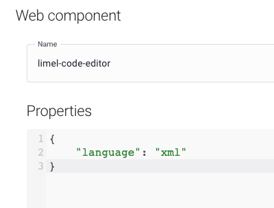
- Under Web component, enter the name of the component that you want to use instead of the default component (see screenshot below).
You can, in principle, use any component here. But to be a fully functional form component, that can both display and update the value, the component should implement the FormComponent interface.
It's also possible to set additional properties by specifying them as a json blob in the Properties field. In this example, we set the language property to "xml", to ensure that limel-code-editor always uses syntax highlighting for XML.
{
  "language": "xml"
}
Tabs
Each object card is composed of a details tab, a set of relation tabs and a set of custom tabs. There is one tab added for each relation described in the card config.
Tab Views
Each tab can have one or several different views. You configure that via the general config for each limetype in lime-admin:
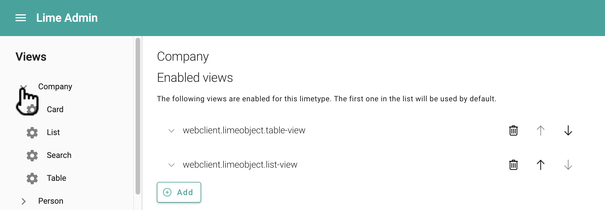
The first one in the list will be selected as the default view.
The following views exist in the platform and can be used by any solution:
| View | Default title (msgid) |
Default icon |
|---|---|---|
limec-table-view |
webclient.limeobject.table-view |
activity_feed_2 |
limec-list-view |
webclient.limeobject.list-view |
insert_table |
limec-history-view |
webclient.limeobject.history-view |
property_with_timer |
Each view is represented by a single web component. In addition to using any of the provided views listed in the table above, you create your own web component to work as a view, and use it here.
Each view can be configured to use a custom title and icon. The title is a msgid that references a translation described in your solution's translations module or in another limepkg. (Read more about translations here.)
You can also configure the views via the code editor:
{
  ...
    "general": {
    "views": [
      {
        "title": "webclient.limeobject.table-view",
        "icon": "insert_table",
        "view": {
          "name": "limec-table-view"
        }
      },
      {
        "title": "webclient.limeobject.list-view",
        "icon": "activity_feed_2",
        "view": {
          "name": "limec-list-view"
        }
      }
    ]
  }
}
Custom tabs
Adding a custom tab is simple. All you have to do is configure the tab via Lime Admin:
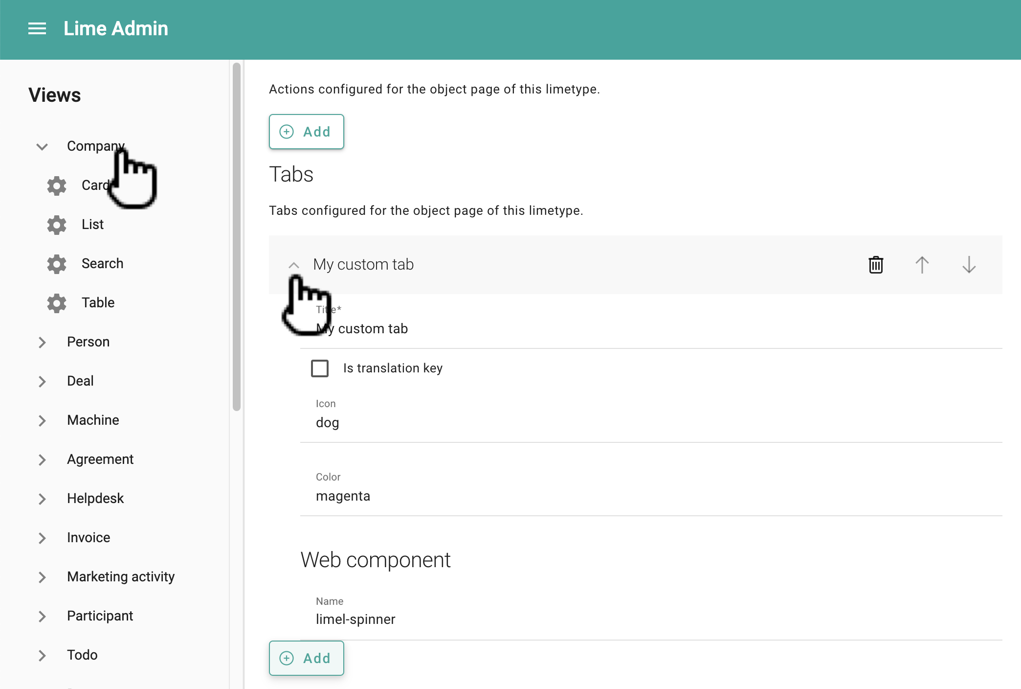
You can also configure it via the code editor:
...
"tabs": [
      {
        "component": {
          "name": "my-custom-tab-component"
        },
        "title": "My custom tab",
        "icon": "dog",
        "color": "magenta"
      }
    ]
Actions
You can add actions to the object card via the general config in Lime Admin. The only thing you need to specify is the ID of the action. For info about how to create actions, see this tutorial.